More Than Just a Pretty Colour: The Science of Calm
The colours that surround us do more than just look nice; they speak a silent language to our brains, influencing our thoughts and feelings. When it comes to your home, a professional interior painting Edmonton service can help you select palettes that actively reduce stress and promote a sense of well-being. It’s a field where art meets psychology, turning your walls into active participants in your daily peace.
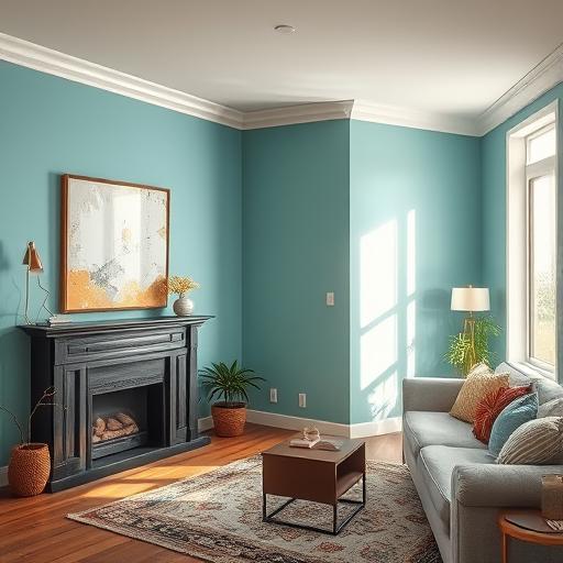
Generally, colours are split into two camps: warm and cool. Warm tones like red and orange are stimulating and energetic, while cool tones like blue and green are often associated with calmness and serenity. Understanding this basic principle is the first step toward consciously designing a space that supports your mental and emotional health.
Embracing the Blues: The Ultimate Calming Hue
Blue is the undisputed champion of calm. Think of a clear sky or a tranquil sea—these images instantly bring a sense of peace, and the colour blue does the same for your interiors. It’s known to have a physiological effect, helping to lower blood pressure and slow your heart rate, making it an excellent choice for bedrooms and bathrooms where relaxation is key.
Not all blues are created equal. A soft, powdery blue can make a room feel spacious and airy, perfect for a fresh start to your day. On the other hand, a deep, moody navy can create a sense of security and intimacy, wrapping the room in a comforting embrace. The shade you choose can fine-tune the calming atmosphere you’re looking to achieve.
Go Green: Connecting with Nature’s Serenity
Green is nature’s neutral, and bringing it indoors is a surefire way to cultivate a restful environment. It represents growth, harmony, and renewal, striking a beautiful balance between invigorating and soothing. Since our eyes have to do very little work to process the colour green, it’s a physically relaxing shade that reduces visual fatigue.
From muted sage to soft mint, the greens offer a wide spectrum of tranquility. A gentle sage green can lend a sophisticated, earthy vibe to a living room or office, promoting focus and peace. For a brighter, more playful sense of calm, a light mint green can refresh a kitchen or guest room, making the space feel clean and welcoming.
The Power of Neutrals: Soft and Subtle Peace
Never underestimate the power of a good neutral! Colours like soft grey, warm beige, and creamy off-white create a stable and serene foundation for any room. They don’t demand attention, which allows your mind to rest and declutter. This makes them an ideal canvas for creating a peaceful, minimalist aesthetic.
The secret to a stunning neutral space is texture and layering. Combine a soft greige on the walls with a plush cream rug, linen curtains, and wooden accents. This combination of different textures adds depth and warmth, preventing the room from feeling flat while maintaining its soothing, understated elegance.
Pretty in Pink (and Purple): Gentle and Nurturing Tones
While often associated with nurseries, soft shades of pink and lavender have a wonderfully calming effect that works in any room. Dusty rose and blush tones evoke feelings of gentleness, compassion, and comfort. These colours can soften a space, giving it a warm, nurturing glow that feels like a gentle hug.
You don’t have to paint an entire room bright pink to get the benefits. A single accent wall in a muted blush can add warmth to a neutral living room. Similarly, shades of lavender and lilac bring a touch of whimsy and tranquility, making them perfect for creative spaces or bedrooms where you want to encourage restful dreams.
The Role of Light and Finish in Your Calm Oasis
The perfect paint colour can look completely different depending on the light in the room. Natural daylight changes throughout the day, altering the appearance of your walls from morning to night. It’s always a good idea to test paint swatches on your wall and observe them at different times before making a final choice.
The finish of your paint also plays a part in the room’s overall feel. A matte or flat finish has no shine and is excellent at hiding surface imperfections, giving walls a velvety, soft look that diffuses light gently. An eggshell or satin finish has a slight sheen, making it more durable and easier to clean, which can bring its own kind of peace of mind in high-traffic areas.
Creating Your Personal Sanctuary: It’s All About You
While colour psychology provides excellent guidelines, the most important factor in creating a calm home is you. Your personal experiences and cultural background shape your relationship with colour. A shade that one person finds soothing might be uninspiring to another, so trust your own intuition.
Your home should be a reflection of what brings you joy and serenity. Use these ideas as a starting point, but don’t be afraid to choose a colour that simply makes you happy. By painting your space with intention, you create a personal sanctuary that truly supports your well-being every single day.